Meta Video Productions Rebrand
Meta Video Productions is a global team with 16 offices around the world, working with Meta and its clients to bring motion ideas to life.
When Meta changed its title and brand identity, the MVP (previously Facebook Video Productions) team followed.
I was the art director and the designer of the rebrand. I was also one of the animators working on the project.
Art director: Yuliya Osyka
Designer: Yuliya Osyka
Illustrators: Yuliya Osyka, Scott Brazee
Animators: Yuliya Osyka, Scott Brazee
Logo
The logo mark takes inspiration from the Meta logo’s enclosed infinite design, which also reflects the full-service MVP studios provide around the globe.
The triangular shape is a nod to the previous version of the logo with the “play” symbol. It also points to the three main MVP directions: video production, animation, and AR&VR.
Logo lockup


Typography and Color
Typography is referencing one of Meta’s brand font - Optimistic Display.

The chromatic palette uses Meta’s Sympathetic system.

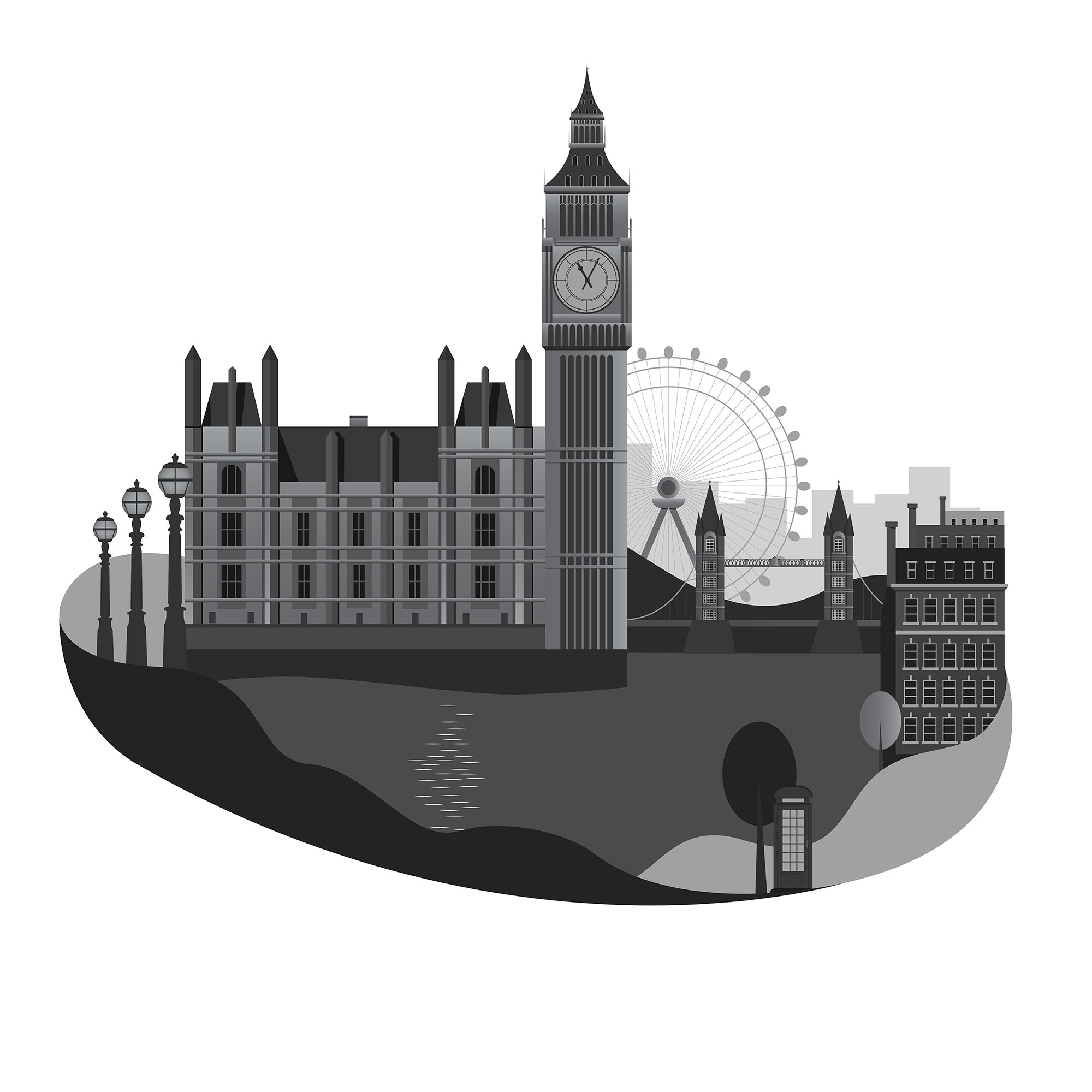
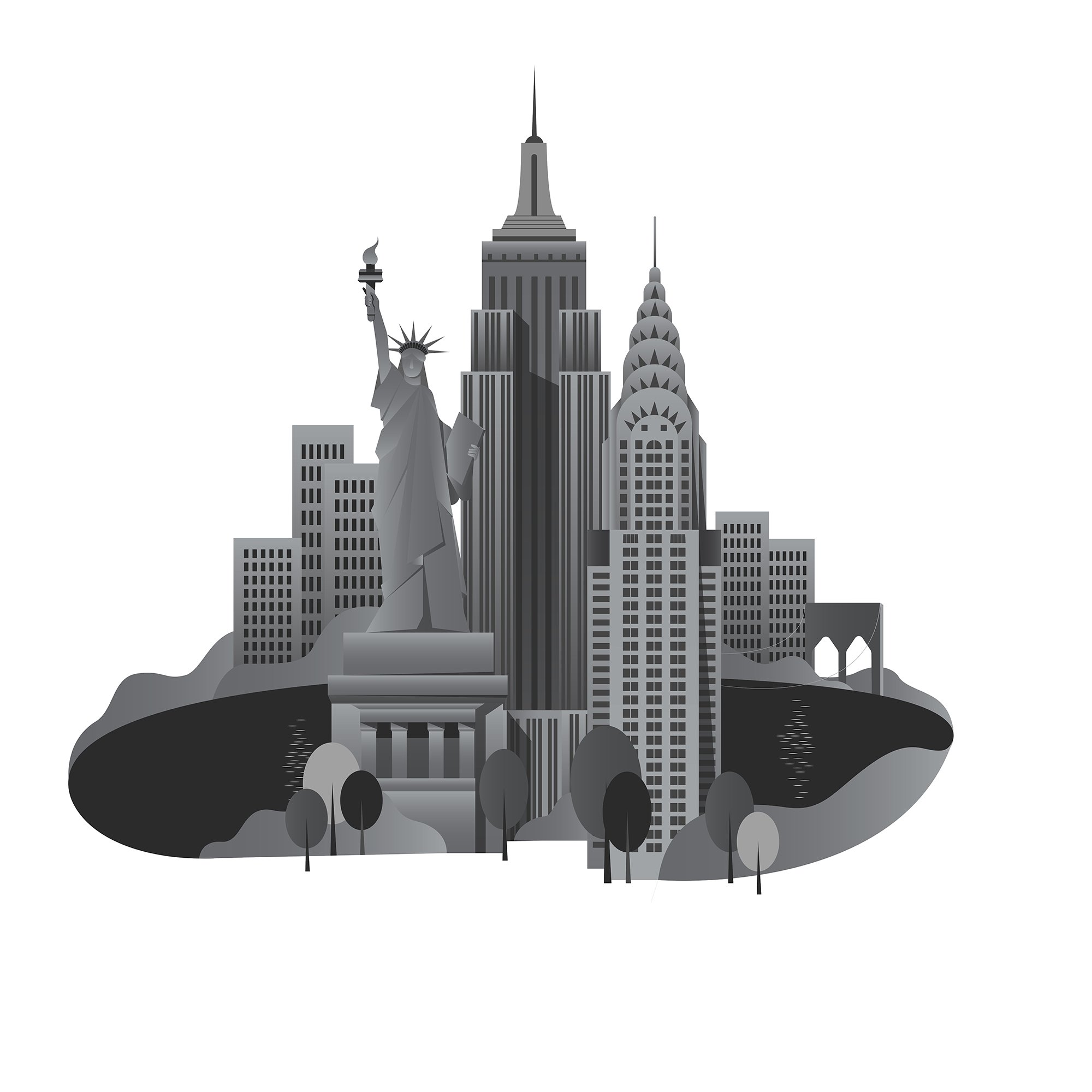
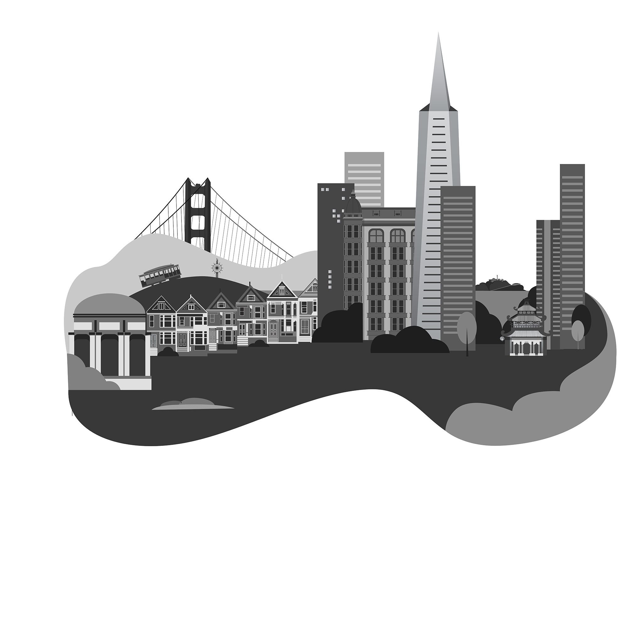
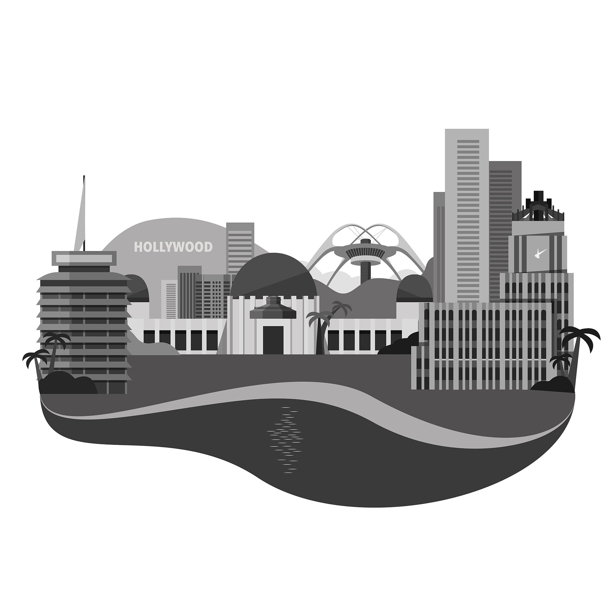
Illustration System for MVP’s Locations.
I wanted to reflect the multitude of MVP’s office locations with unique animated illustrations.
Each illustration uses 2 colors within the Meta’s Sympathetic palette.


Preliminary greyscale illustrations